Category Archives: Health

  • -
Political Pitfalls Ahead by John Black, AFR New Year Special

Political Pitfalls Ahead

Category:Demographics,Health,Housing

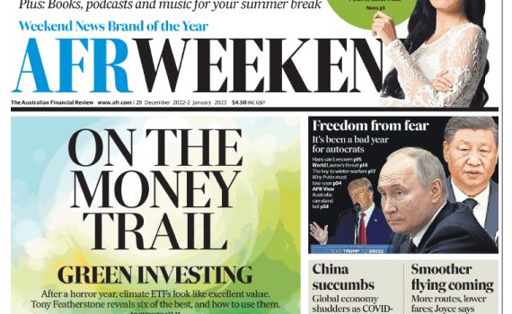
I have a little opinion piece in the Australian Financial Review’s New Year Special Edition on some of the political and economic issues awaiting the attention of the Commonwealth Government during 2023 and AFR subscribers can find it here: https://www.afr.com/politics/federal/albo-looks-a-shoo-in-but-a-lot-could-go-wrong-in-2023-20221227-p5c8we

The story uncovers some unexpected Covid impacts for 2023 and beyond for population growth, the labour market, the economy and the housing market, along with Energy, Health and Education.

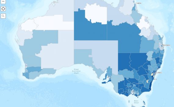
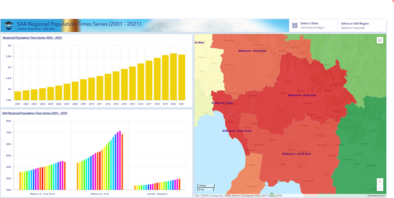
Education Geographics Chief Mapper Dr Jeanine McMullan has prepared a publicly-available online map, showing the latest spatial impacts of Covid on population growth and you can access the map here:  https://www.arcgis.com/apps/dashboards/05c26440e9474666ba48ecc8384f24d8

Education Geographics Chief Mapper Dr Jeanine McMullan has prepared a publicly-available online map, showing the latest spatial impacts of Covid on population growth

We hope you enjoy the article and the map. All the best for Christmas and the New Year folks!


  • -
Covid Vax Map Update 9-9-2021

Vacination Map Update as at September 13, 2021

Category:HealthTags : 

The Australian Department of Health is now publishing regular updates showing vaccination rates as a percentage of those 15 years and above, presented by Australian Bureau of Statistics SA3s.

In the public interest, the CEO of Health Geographics Dr Jeanine McMullan has mapped, via the following link, the distribution of those Australian 15 years and above with one jab, two jabs and one jab minus two jabs. These updates will be uploaded to this map link as they become available, beginning with September 6, 2021.

It was felt that those Australians with one jab, awaiting a second jab, were more likely to represent recent vaccination trends, as eligibility criteria has recently extended to younger groups and a broader range of priority groups and this in turn has been heavily influenced by recent Covid outbreaks in New South Wales, Victoria and the ACT.

There are 335 SA3s in Australia, with an average of about 60,000 persons aged 15 plus years.

Smaller SA3s in remote or regional Australia contain about 10,000 persons 15 plus years. The larger SA3s include the inner cities of Sydney and Melbourne containing up to a quarter of a million persons 15 years and over. They provide a reasonable picture of a significant health event now taking place across the nation.

The Esri map https://arcg.is/1DeX1H0 can be opened and managed on virtually all devices, including PCs, Tables and Mobile Phones.


Covid Vax Map Update 9-9-2021


  • -
Vaccination Rates by Age and Jabs by Family Income by Health Geographics

Profile of Australian Regional Vaccination Rates, as at August 28, 2021

Category:HealthTags : 

By John Black, Chairman of ADS

So many readers enjoyed the online Covid Vax maps from Health Geographics CEO Dr Jeanine McMullan at https://arcg.is/1DeX1H0 that we decided to publish a short descriptive profile of the map data, with some relevant comments for those apparently in charge of the roll out.

Introduction. Those shown in the SA3 maps with both their first and second jabs against Covid as at August 28, included the old and the rich, the traditional Coalition voters, along with their Green-voting neighbours in wealthy inner-urban regions. These two demographics dominated the Melbourne seats which also swung heavily to Federal ALP candidates in 2019.

Those with neither jab were dominated by younger and lower income Working Families, living in the middle burbs, and the Digitally Disrupted, including the longer-term unemployed, living in lower SES outer suburbs and provincial cities, two groups which deserted the ALP in 2019 and returned Scott Morrison to the Lodge.

However, with recent Covid Delta outbreaks in NSW, where vaccination has become virtually compulsory for many NSW residents, there has been a significant recent rise in the numbers of demographics with first jabs only and this has come across wider age and income groups, making the roll-out more egalitarian and focused on classic Swinging Voters, home-buying families with kids.

Process

To get some reasonably reliable demographic profiles of vaccination rates, we took Australian Government Health Department vaccination rates by SA3 as at August 28, for those 15 years and older with one and two jabs and then we controlled for outlying state and regional anomalies, driven up by Covid outbreaks in New South Wales and held back by roll out road blocks in outback regions.

We had to control for outbreaks because it is becoming blindingly obvious that Covid vaccination rates are being driven up among mainstream demographics by Covid Delta outbreaks, which, sooner or later, will impact most harshly on the low-vax states of Western Australia and Queensland.

Profile of the Fully Vaccinated with Two Jabs

The profiling tells us that Covid outbreaks weren’t needed to drive strong vaccination rates among the elderly and the better-educated rich, especially those retirees living off private super funds, who tend to have private health insurance and spend an awful lot of money on their health needs at their Family Doctor, their dentist, their optometrist or their physio.

The better-off elderly persons with Senior Health Care cards were near top of the list.

This group became eligible because their age and vulnerability to Covid Alpha prioritized them in the vaccine queue. And, because older voters typically support the Coalition, those vaccinated as at August 28 voted for the Coalition in 2016, but a bit less so in 2019, when this older and richer demographic drifted to the ALP, especially in Melbourne’s Goat Cheese Circle.

Culturally, we found fully vaccinated regions contained more migrants from wealthier countries, such as Canada, Germany, Hong Kong and Japan.

A lack of faith featured prominently here, with the big Green-voting group of Agnostics top of the list for those trusting in the science and getting access to the rollout.

Those least likely

Those least likely to be fully vaccinated were dominated by those in the bottom income quartile, mainly those on some form of transfer payment, other than the big group of those on the aged pension.

They were joined by the big blue-collar groups of less qualified low-wage earners working as labourers, plant and machinery operators or as transport and logistical workers, which is causing the current delivery chain chaos in western Sydney.

We also found certificate-qualified, average-income earners in receipt of Family Tax subsidies, working as Tradies, service workers or sales workers, often in mining or manufacturing industries.

Migrant groups strongly represented across regions with low vaccination rates were dominated by the big group of Kiwis, along with those born in Vietnam and Pakistan and followers of Islam or Sikhs.

Across these under-vaccinated groups, we came across many of those belonging to the smaller, evangelical Christian faiths, the sort who elected Kevin Rudd in 2007 and re-elected Scott Morrison in 2019 across a wide range of outer-suburban or regional seats in Queensland and NSW.

These include Christians not fully defined, along with smaller groups of Jehovah’s Witnesses, Mormons, Seventh Day Adventists and Pentecostals, all of which lined up behind Scott Morrison in 2019.

Again, more narrowcast social media networks could have played a part here with evangelicals, as mainstream Christian faiths were not significant markers for the unvaccinated. These included Catholics, Anglicans, Uniting, Presbyterians and Lutherans.

Profile of those with time only for One Jab

Those with one jab only represent persons who have recently qualified to join the queue by virtue of age, location or some other criteria, such as state mandates, as well as those more strongly motivated by recent outbreaks in NSW and Victoria to become fully vaccinated.

Given the delay between the first and second jab there’s going to be some overlap between these groups, but looking at the difference between the two rates tells us something about these groups that a competent Government could find useful.

We will keep an eye on these trends, but all that we could glean so far is that the updated eligibility demographics for those aged 40 and above and a widening range of selected groups aged 39 years and below seem to have democratised the vaccine roll out considerably.

Whereas before the vaccine was mainly for the old and the rich, it is now being taken up more by mainstream Australians: low- and middle-income blue-collar families, paying off their own separate home, with two or three kids at public schools and a couple of cars in the garage enabling commutes to two jobs. We’re talking Swinging Voters here folks and they want their kids safely back at school, with teachers and students – starting with high school students – vaccinated.

Even in the last week, we’re also seeing signs of those overlapping working-class demographics dominating western Sydney, shown in darker green on Dr McMullan’s online map: Transport Workers, Clerks, the Unemployed, Arabic-Speaking families, parents of kids at Government schools, migrants from Fiji the Philippines, Lebanon and Pakistan, followers of Islam.

What we are now seeing are glimpses of what could have happened in Australia, if we’d purchased enough supplies of vaccines when we had the chance, allied to a roll-out becoming open to all wanting to be vaccinated. As my favourite Covid statistician, the ABC’s Casey Briggs would say: who’d have thought?

The lessons your humble correspondent – with no pretensions to expert status on Covid – would draw from the evidence here, are that the Government should focus pro-vax campaigns on less well-educated persons, blue collar workers and their unions, along with non-English-speaking migrants and those with time on their hands to waste on social media fruitcakes.

Prosecution of a coherent and consistent case from the Coalition Government would be a good start. A bit of old-fashioned national leadership on a policy framework for mandating vaccinations for key workers would help too. And the sort of ticker we saw from John Howard when he fronted up to a crowd of angry gun nuts wearing a bulletproof vest to argue for gun control.


John Black has pioneered demographic and political profiling in Australia since the early 1970s and is a former Labor senator for Queensland. He is Executive Chairman of profiling company Australian Development Strategies and the relevant vax map can be found at https://arcg.is/1DeX1H0
  • -

Vaccination Maps

Category:HealthTags : 

Vaccination Maps

In the public interest, the CEO of Health Geographics Dr Jeanine McMullan has mapped via the following link, the distribution of those 15 and above with one jab, two jabs and one jab minus two jabs. It was felt that those with one jab, awaiting a second jab, were more likely to represent recent trends, as eligibility criteria has recently extended to younger groups and a broader range of priority groups and this in turn has been heavily influenced by recent Covid outbreaks in New South Wales, Victoria and the ACT.

Click Click on the I for more Information for more information.

The Australian Department of Health on August 28 published data showing vaccination rates as a percentage of those 15 years and above, presented by ABS SA3s.

There are 335 SA3s in Australia, with an average of about 60,000 persons aged 15 plus.

Smaller SA3s in remote or regional Australia contain about 10,000 persons 15 plus years. The larger SA3s include the inner cities of Sydney and Melbourne containing up to a quarter of a million persons 15 and over. They provide a reasonable picture of a significant health event now taking place across the nation.

The Esri map can be opened and managed on virtually all devices, including PCs, Tables and Mobile Phones.


  • -
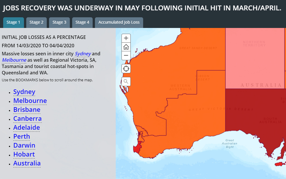
Jobs Recovery was underway in May following intial hit in March / April.

Jobs Recovery Was Underway In May Following Initial Hit In March/April

Category:Health,Labour MarketTags : 

The recovery in many jobs was well under way in May. It’s been most pronounced in those hit first in March/April, working in hospitality, young home buyers, young casual workers also studying at TAFE and this is all to the good.

The downturn however continued in May among farming and rural communities, especially fishing (think lobsters in cargo holds of international tourist flights). This has impacted coastal and many rural communities.

The overall picture from March to the end of May shows mainstream suburban families (married, middle aged, with a mortgage and kids at school, two jobs that they really need, and going to church occasionally) to have been much less affected by Covid or by the follow-up lockdowns – down about five percent. These are the groups which weren’t picked up in the polls before the last election and which re-elected Scott Morrison as PM.  

The groups in deepest trouble (ten percent plus loss over jobs) over the period March to May were – despite a recovery in May – still the workers in casual hospitality and arts & rec jobs (agnostics, twenty somethings, living in small rental units, single, agnostics, no kids, Green voters).

Link to Map

 Jobs Recovery was underway in May following intial hit in March / April.

So, good is down only five percent and getting better slowly. Bad is ten percent and getting worse slowly. Spatially, Tasmania looks pretty awful, as do many rural and coastal communities, but the really horrible bits on the map are the inner-city suburbs, particularly in Melbourne and Sydney, where Covid cases have been most concentrated.

Because the jobs lost in many cases have been second or third casual jobs and less well paid, the impact of jobs lost to the economy has been a bit overstated and has actually increased average incomes per job in many suburban areas, especially with large public sector payrolls.

This is, however, pretty cold comfort, for those relying on Government handouts and counting down to the end of September.

What was the real rate of unemployment in May? The short answer is 11.5 percent. This is obtained by maintaining the pre-Covid lockdown participation rate at the March level of 66.2 percent and applying this to the Civilian population 15 years and over, producing a potential workforce of up to 13, 770,061 in May. The combined numbers of officially unemployed and those who dropped out was 1,579,639. We used original or unadjusted figures as seasonal adjustments have become overwhelmed by Covid lockdowns and only original figures are used spatially for smaller areas. The original unemployment figure was marginally higher at 11.7 percent and 12.1 percent respectively in January and February 1993.

The figure of 11.5 percent also resonates with the new and more immediate ABS series on Weekly Payroll Jobs and Wages, which shows 5.6 percent of main jobs were lost between March 14 and the end of May and the official March unemployment rate was 5.6 percent in March. The two figures sum to 11.2 percent.

This means the current unemployment rate is as bad now as it was during the worst of the recession in the early 1990’s. The unemployment figure then was marginally higher at 11.7 percent and 12.1 percent respectively in January and February 1993.

The current figures for the one touch payroll data have been recovering slowly from the initial impact of the Covid jobs lockdown in early April, and this 11.2 percent hybrid figure is likely to continue (barring a second wave starting off from Victoria) at least until the Government begins to wind back JobKeeper and JobSeeker in September.

The realistic figure for unemployment rates at that time will be determined by whether the rate of recovery exceeds the rate at which those now on JobKeeper or JobSeeker join the ranks of those actively seeking work and satisfying the ABS definition of being unemployed.

The official ABS labour market unemployment rate is now pretty meaningless, as participation rates will tend to decline with relatively older and younger workers dropping out of the labour market.

In fact, the first sign of a recovery in a recessed regional labour market can be an interim increase in the local unemployment rate, as formerly discouraged workers are encouraged to seek work by becoming officially unemployed on a temporary basis, while actively hunting for a job and hence immediately boosting participation rates and then growing employment in the longer term.

So the most useful indicators you should be watching for in coming months are total jobs lost and gained by region and accompanying movements to participation rates.


Text by John Black, founder of ADS and EGS. Maps by Dr. Jeanine McMullan, CEO of Health Geographics.


  • -
Impact on Australian Employment by COVID-19 21st May20 20

Impact on Australian Employment by COVID-19

Category:Health,Labour MarketTags : 

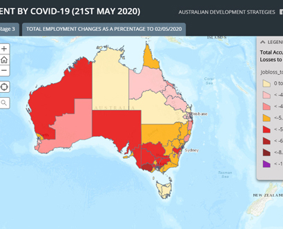
We trace the jobs impact of the Covid-19 labour market shutdown in a news article and a linked online story map published in The Australian today.

The story outlines the evidence that the jobs downturn impacts announced by the Prime Minister in late March were sudden and deep and that since then, there have already been some tentative signs of a small jobs recovery in those states with lower levels of new Covid-19 cases, in apparent anticipation of an easing of social distancing and travel restrictions. However, in those states with continuing cases of new community transmission the downturn in higher SES professional jobs has deepened.

The article is available only to The Australian readers and subscribers and covers the new payroll data provided to the public by the Australian Bureau of Statistics, as a public service, while the data is still being developed.

The ADS/Esri maps in the article are based on 2019 Federal electorates and use the same data, so caution is advised. They are user-friendly for mobiles and are available on the ADS website at https://www.elaborate.net.au/impact-on-australian-employment-by-covid-19/

John Black, ADS Chairman. Dr Jeanine McMullan, Chief Mapper.


Click for Federal Seats Jobs Map

Impact on Australian Employment by COVID-19 21st May20 20


  • -
Total Job Losses Due To Covid 19

Mapping the impact of Covid downturn

Category:HealthTags : 

A co-operative venture between Australian Development Strategies, Health Geographics and Education Geographics has set out to regularly monitor, profile and map big data on jobs and wages from 10,000,000 Australians during the Covid recession.

The jobs data is now being collected weekly via the Tax Office one touch payroll system and published fortnightly by the Australian Bureau of Statistics.

The first of a series of maps has been published today on the three web sites via the following link https://arcg.is/1HeD5n It will allow readers to see the impact of the Covid restrictions and monitor changes as they are withdrawn in stages over coming months.

More detailed maps and profiling will be made available to clients of the three companies ADS, HGS and EGS.

The first maps published today show most jobs and wages lost by suburb have been close to capital city CBDs, coming as a direct result of the closure of gyms, personal training groups and theatrical productions.

The biggest per capita loss of jobs has occurred across smaller suburbs in rural and tourist regions like Mount Beauty in Victoria or Port Douglas in far north Queensland.

Suburbs across Australia relatively unaffected by jobs loss or per capita jobs loss have dominated by public sector jobs, such as Duntroon, Macarthur or Barton in the ACT, in remote indigenous communities like the APY lands in South Australia or Arnhem Land in the NT, or in mining towns like Mount Isa or Weipa in Queensland or Roxby Downs in SA.

As schools progressively re-open and restrictions are lifted on travel, hospitality and public gatherings, we will monitor the changes in jobs and wages for our readers and clients.


  • -
COVID 19 Map published in the The Australian

Link to Covid 19 Map Published in the The Australian

Category:HealthTags : 

A demographic profile of Covid-19 begins to emerge from the chaos of the first wave of tests.

Dear Colleagues, this is our second update on Covid-19, based on the data we’ve been able to assemble so far, compiled from spatial profiles of LGA testing results in New South Wales and Victoria. More states providing this LGA data to the public would be greatly appreciated.

It’s important to acknowledge that what we’re looking at with this data is the result of the first wave of testing, mainly centred on Australians returning from overseas holidays.

Many of the older members of this group returned on cruise ships, so much so, that cruise ships have been identified by the Commonwealth as a country in their own right, when it comes to overseas sources of the virus.

The layperson’s profile of this group would say it’s the 60 years and over group, wealthier, retired and the layperson would be pretty right. I guess we all know a bit more about this group, because it’s the one at most risk from serious illness and this justifiably gets the most attention.


Continue Reading:

A demographic profile of Covid-19 begins to emerge from the chaos of the first wave of tests.